TANGERINE TANGO
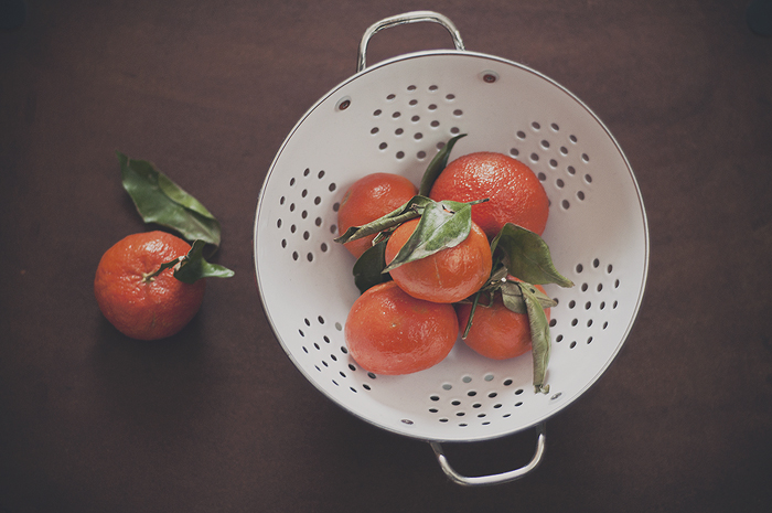
I was just reading about Pantone's chosen color of the year 'Tangerine Tango' in two separate articles last night {read one here}, and today I realized when spotting the below tangerines at the market just why this color does indeed "provide the energy boost we need to recharge and move forward" as Pantone so passionately describes the hue. This afternoon I shot my own purchased tangerines and have edited the images below, however I have not played with saturation {except for the black/whites obviously} therefore you are truly seeing their real "spirited reddish orange"; also Pantone's description of their chosen color of the year.
When I saw the heap of pretty tangerines at the market earlier, I instantly thought of one of my favorite painters, Cezzane. I've always enjoyed how he played with both shapes and color of fruit in many of his paintings. He was known to use bright fruits such as apples and oranges and grapes and let their strong shape and bold color create a more modern scene in color blocking and dimension. Very contemporary in aesthetics yet traditional in medium, much like my own desired style. When I got home and I set the tangerines down to quickly take an iPhone Instagram, I observed them demanding attention both in shape and hue and I just fell in love with their strong graphic presence and had to bust out the big guns to further the capturing. Really, looking at how the tangerines made the scene made me think of Cezanne's 'Apples and Oranges'. So, I suppose here is my own take on that famous painting...


I love this little photo project that you just made for yourself. So inspiring friend.
ReplyDeletewell thank you friend!
ReplyDelete